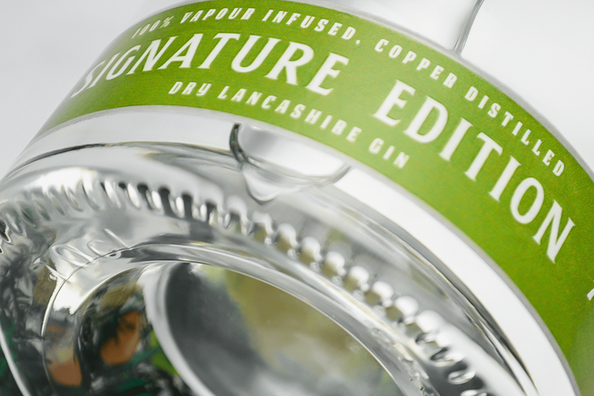
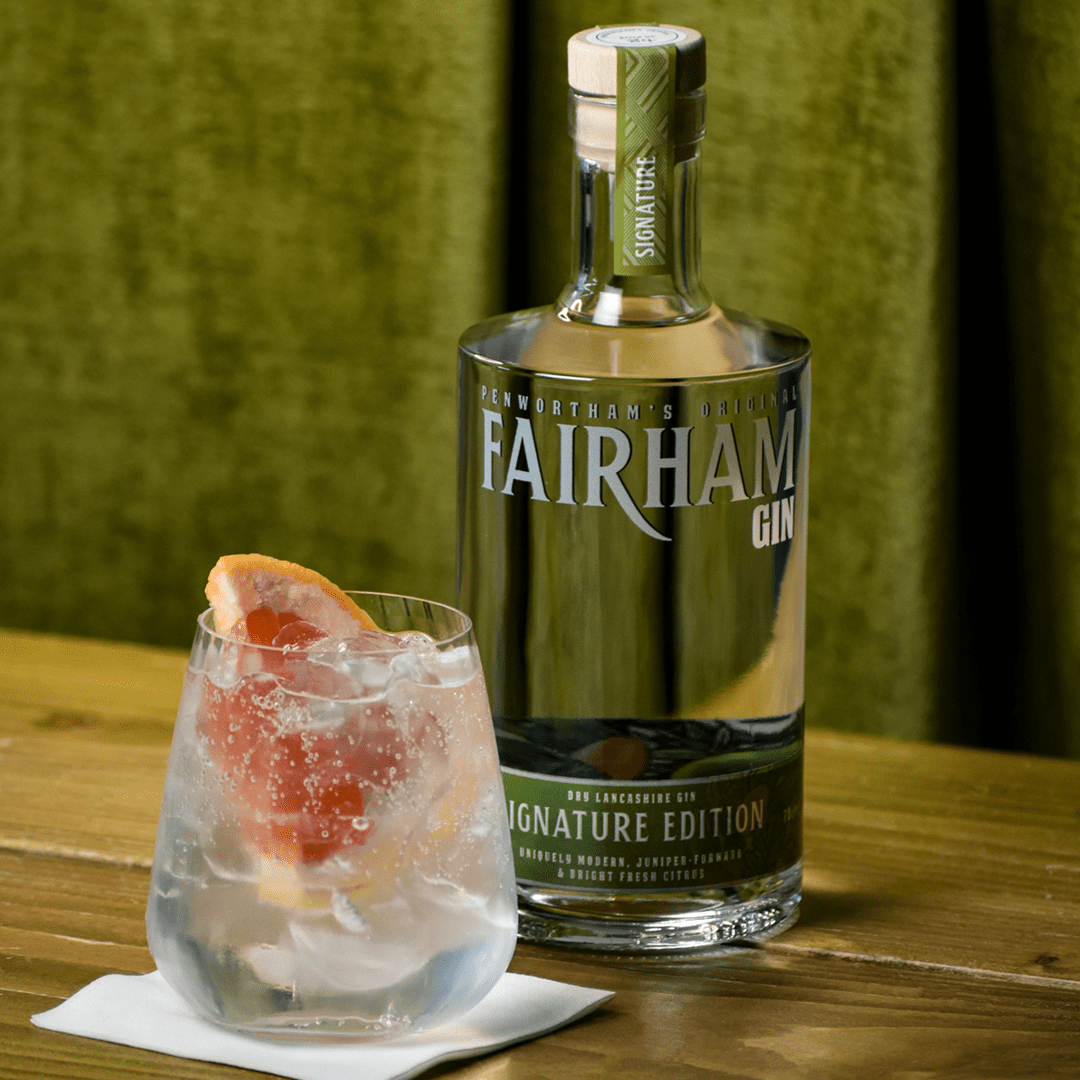
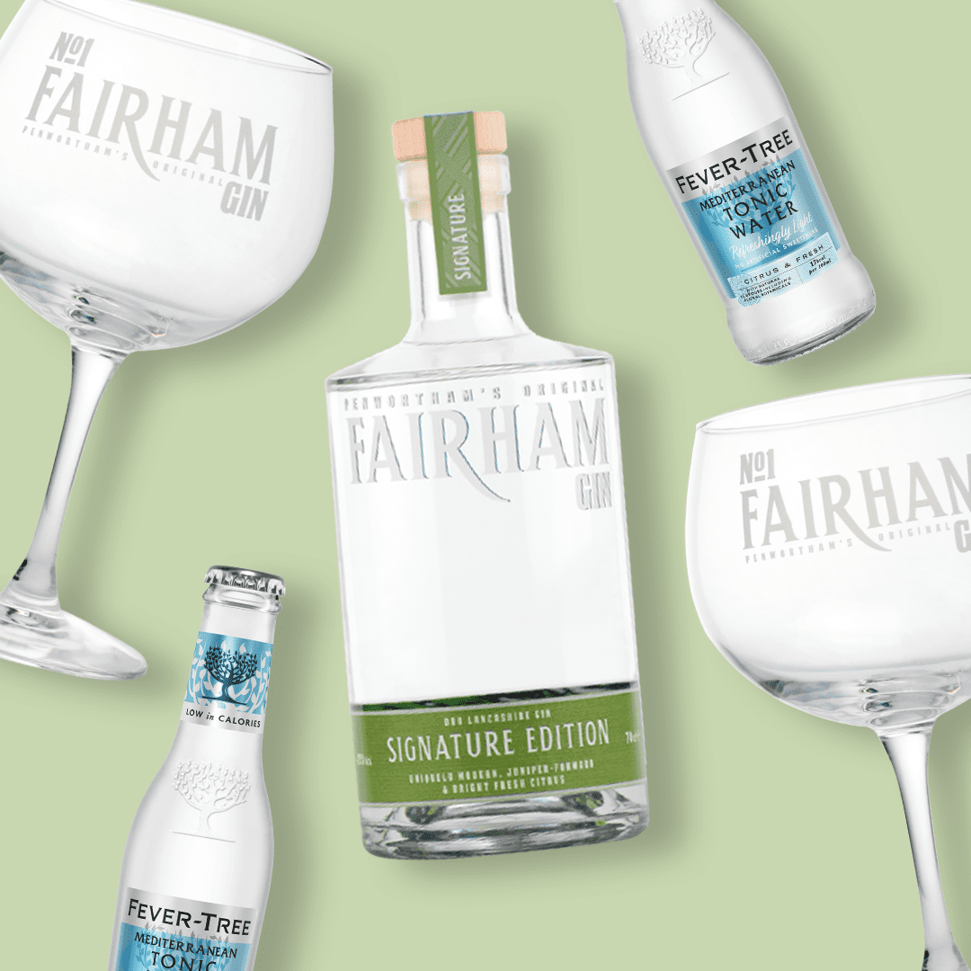
Introducing our new craft gin bottles! Six months on since the launch of our Lancashire craft gin in April 2021, we have now revamped our Signature Edition look, still with all the fitting colours, illustrations and designs, but with a new feel and elegance.
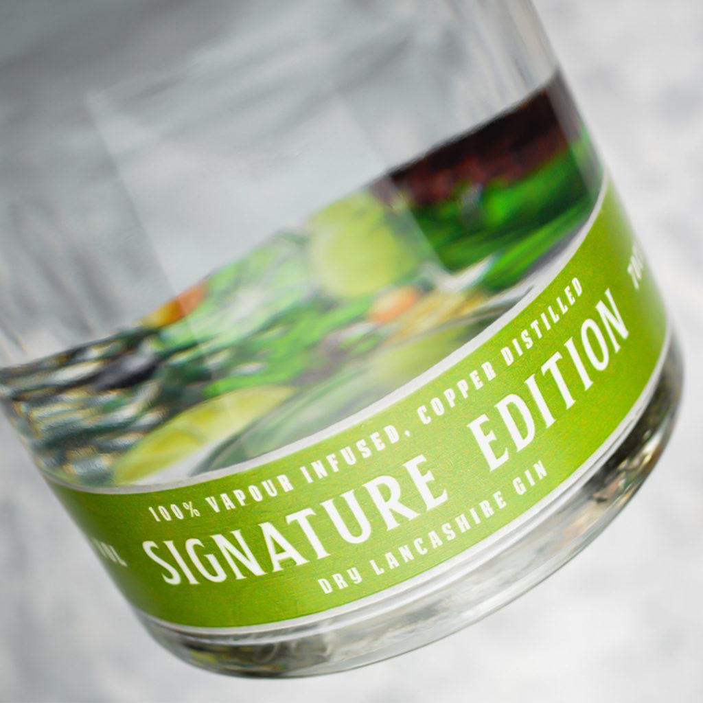
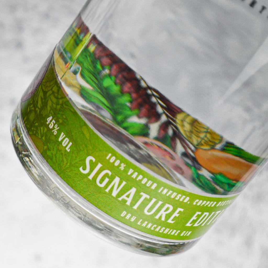
To start off, we’re no longer a London Dry Gin, but rather a Dry Lancashire Gin, paying homage to our home county. Since we are named Penwortham’s Original it only made sense to further emphasize where our craft gin is from, with the method of distilling still in a true typical London Dry style. Our neutral grain spirit is 100% vapour infused together with only the best botanicals and exotic fruits, with no artificial ingredients, colour or flavour added after distillation. We created our gin on the basis of providing you with a juniper-forward gin, as it should be, but with the addition of citrus layers to really bring it to life but being careful to not overshadow the juniper. Some traditionalists may call our Signature Edition a Contemporary Dry Gin because of this, so that is why we have opted for the new name in our rebrand.
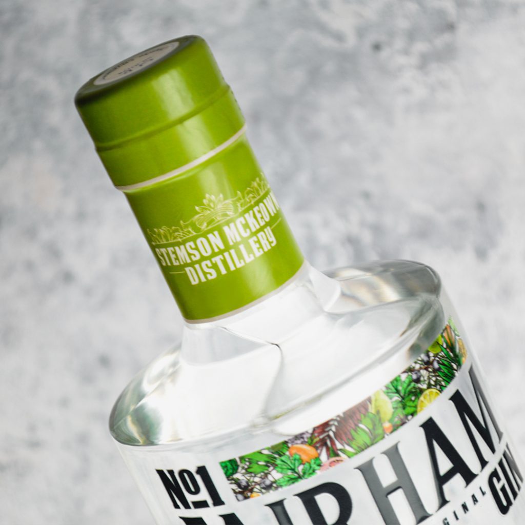
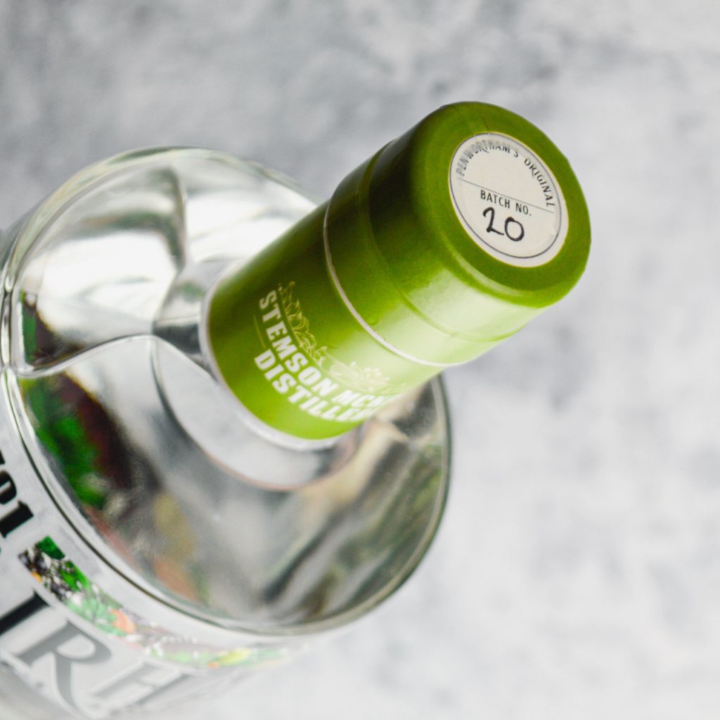
Next up are our neck labels, they are no more! Instead, we have swapped to a fully compostable neck shrink wrap that covers the neck and bottle cap. Once the tamper seal is removed, the bottle still looks exactly like it did before but with more of a sleeker style, with the shrink wrap giving it an almost waxy look and hugs the glass a bit more than the original paper stock label did. As well as adding another notch to our eco-friendly business model with a compostable label, we think it gives our bottle a much more polished finish. This leads onto the next update which is…
… Our batch number. There is a swanky new place for it, with a Penwortham’s Original sticker on the top of the cork. You can see these at the top where the shrink wrap leaves a nice little opening for it to appear through. Every batch number will be handwritten on here so keep an eye out to see which one you get!
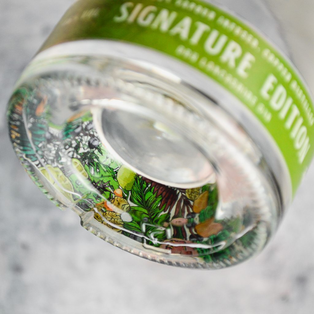
Through lots of pain, arguments, constant loss of product and money, we have now decided to go for a fully printed bottom band. This involves a remodel of the inside botanical illustration which is now brighter and more fuller, representing the irresistible taste and flavours in our craft gin. Our paper stock bottom bands were becoming too time consuming, with them being put on by hand and if they didn’t align properly, then they would just be ripped straight off and couldn’t be used again! Through this very expensive business lesson, this is why we have opted for our new fully printed bottom band, which now matches our new main logo.
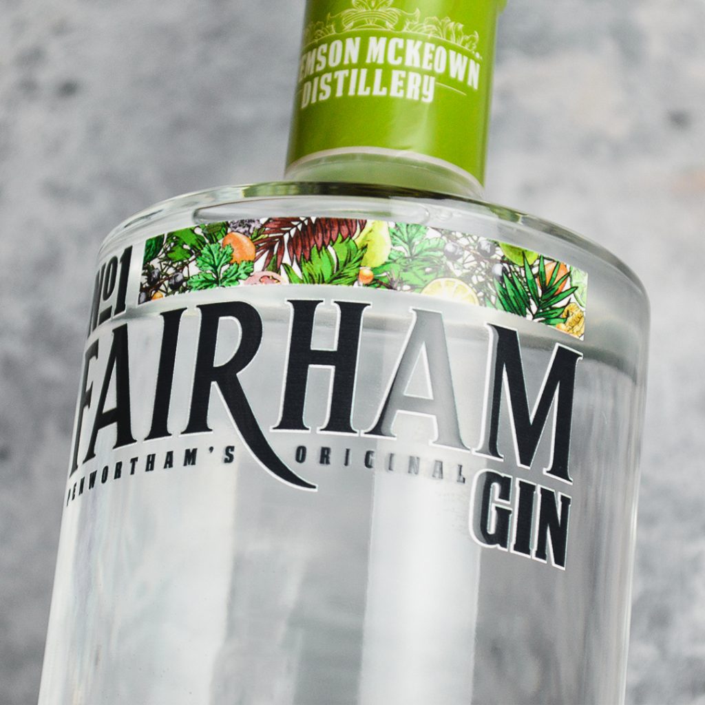
To complete the look, there is the addition of a white drop shadow to enhance the main No.1 Fairham Gin logo. From the very start we wanted our bottle to be clear, with the logo being printed directly on with no background. This is to represent the fresh, smooth taste of our gin, but we kept noticing a few problems with having a dark logo and no light background for it to sit on. The addition of the white drop shadow now makes the logo stand out more in darker settings, so hopefully you won’t have any trouble spotting it at any of our stockists now! Even if you do, just look out for the green neck label, you won’t be able to miss us
The new design in full is now available on our Lancashire craft gin and first appeared on Batch 20 of our Signature Edition craft gin.
Loving the new look!